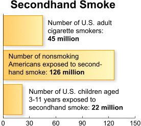
This is a graph showing how many nonsmokers are exposed to secondhand smoke.
Source:
"CDC-Data & Statistics." Centers for Disease Control and Prevention. Centers for Disease Control and Prevention, June 2007. Web. 15 Nov. 2010. <http://www.cdc.gov/datastatistics/archive/second-hand-smoke.html>.
I love this chart because it shows exactly how harmful, dangerous, and how overall gross smoke and secondhand smoke actually is. The statistics on this graph are incredibly horrible, but true. This is what the world needs to see! Can't wait to see how it turns out, keep it up(:
ReplyDeleteThis chart is very explaining the information on your topic. It shows how harmful it is, and I honestly think that this could catch the eyes of smokers these days to make them quit eventually in the future. This is a very good graph for you page. Good job (;
ReplyDelete